
The Power of the Perfect Inventory Balance Chart
In the world of supply chain and warehouse management, inventory is cash. But simply having inventory isn't enough; you need to understand it. That’s where a good inventory chart is worth a 1,000 words. It’s more than just a pretty visualization—it's the critical bridge between raw transactional figures and actionable business decisions.
From Useless Data to Actionable Wisdom
Many businesses suffer from a common affliction: mountains of raw data trapped in spreadsheets. You have rows upon rows of "In," "Out," "Count," and "Date" figures. Individually, these are just facts—the most basic stage of understanding. They hold the potential for insight, but in their raw form, they are useless. They represent a significant pain point for busy warehouse and supply managers who don't have the time to manually sift through thousands of lines to figure out what they need to order or when they’ll stock out.
A well-designed inventory level chart takes this raw data and transforms it into information. This is where the magic begins. The chart aggregates the movements, calculates the current levels, and presents it in a comprehensible, structured format. Instead of seeing a list of 500 transactions, a manager sees a clear line showing stock levels over time.
Key Attributes of a Good Inventory Balance Chart
What distinguishes a truly effective chart from a merely adequate one? It all boils down to delivering immediate knowledge and facilitating swift action.
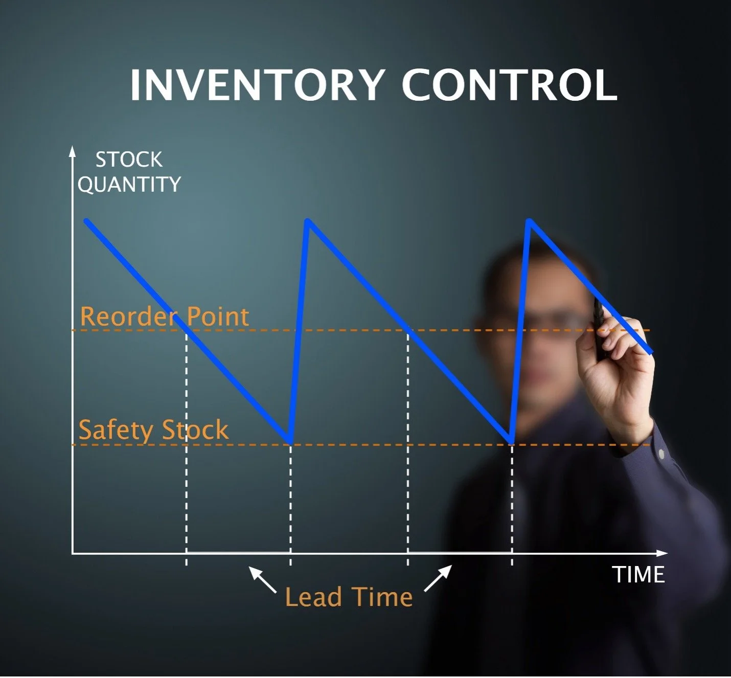
1. Clarity and Context are Crucial
A good chart doesn't just show a number; it provides context. It should clearly display the current inventory level against critical benchmarks:
Safety Stock: The absolute minimum level to prevent stockouts.
Reorder Point: The trigger level for placing a new order.
Maximum Capacity: The limit of physical storage.
This comparison turns a number into a status. A manager knows instantly: "Are we safe, are we running low, or are we overstocked?"
2. Focus on Key Metrics (Velocity and Value)
A single chart can't show everything, but it must show the most important things. Effective charts often highlight:
Inventory Turnover Rate: How quickly stock is being sold and replaced. A low rate signals capital tied up in slow-moving goods.
Stock Value: The monetary value of the inventory on hand, essential for financial reporting.
ABC Classification: Visual segmentation of high-value/high-velocity (A) items, medium (B), and low (C) items, allowing managers to focus their attention where it matters most.
3. Trending for Foresight
The chart must move beyond a static snapshot. It needs to visualize trends. By showing the trajectory of stock levels, it provides the necessary insight to transition from just knowing what is to predicting what will be. Being able to look at organized inventory data and spot patterns helps us forecast what will happen next. This is how we use what we know to make smart decisions.
Delivering Wisdom and Actionable Value
The ultimate value is achieved when this brilliant report is put in the hands of warehouse and supply managers who understand the inventory levels. The visual information instantly activates their tribal knowledge and customer priorities to act and make swift decisions.
This beautiful, simple report eliminates the pain point of drowning in raw data and empowers the team to make timely, proactive, and financially sound decisions. It ensures that inventory is a strategic asset, not a costly liability.